This project was not possible without the work of my other team members: Bukunmi Ogunrosoye, Emma Cullen, and Sameer Islam. I want to thank them upfront for their contribution to this project. Contents shown in this case study are the part of this project I individually worked on.
- School Project
- Responsibilities: User interviewing, UX design, user testing, UI design
- Duration: ~ 1 month
Problem
There is an increasing need to stay connected and organized with regards to meeting time, locations, and time zones. While current digital calendar services allow these connections to be made, they leave much to be desired in the experience, and largely have not changed their core service in the past 10 years.
Process
Research
Before starting the interface design part of this project, our team worked on gathering data to gain knowledge about our potential users. The main user research method we used was interviewing prospective users. From there, we were able to highlight some key user needs that we should include:
- Smart scheduling
- Effective reminders
- Allowing customization
- Tasks, or To-do list
wireframes, prototypes, tests
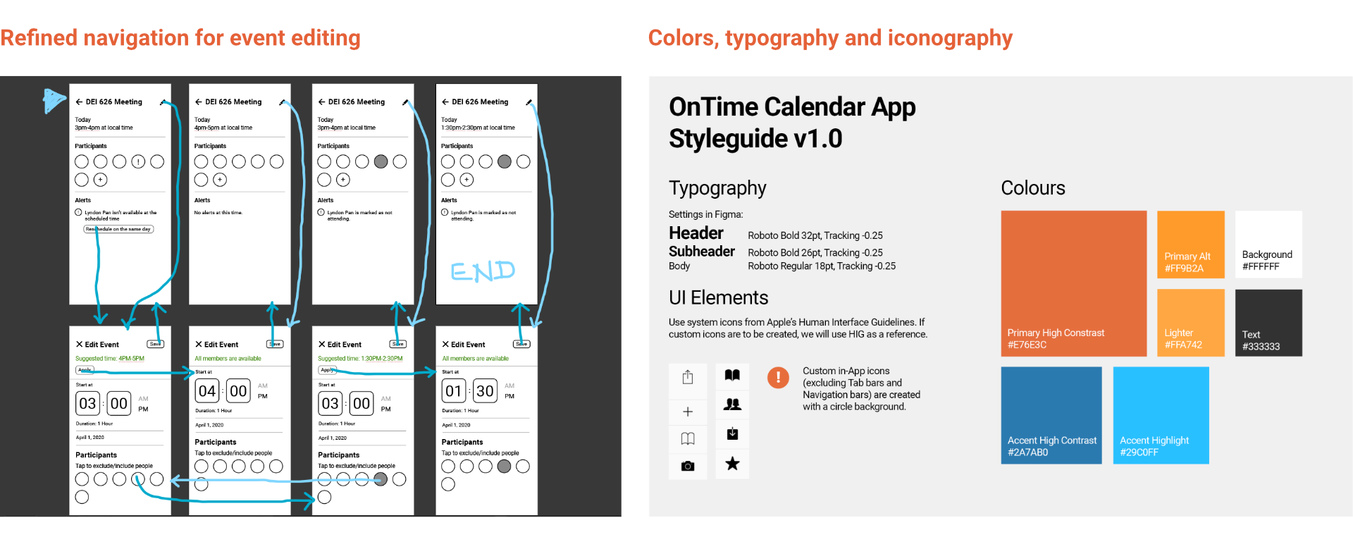
I focused on designing the smart suggestion feature of the app. Some initial wireframes were created to lay down essential user flows:
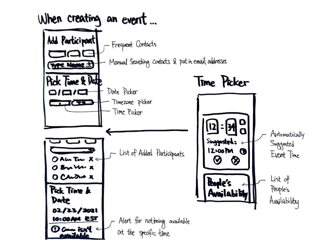
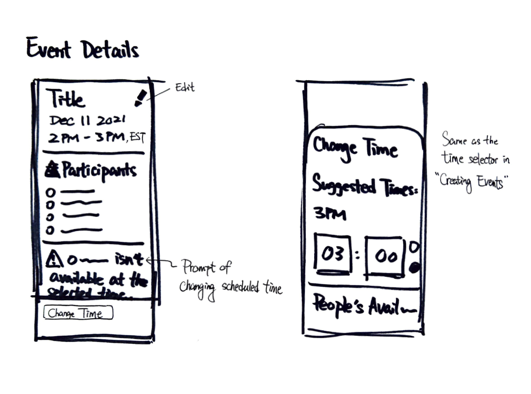
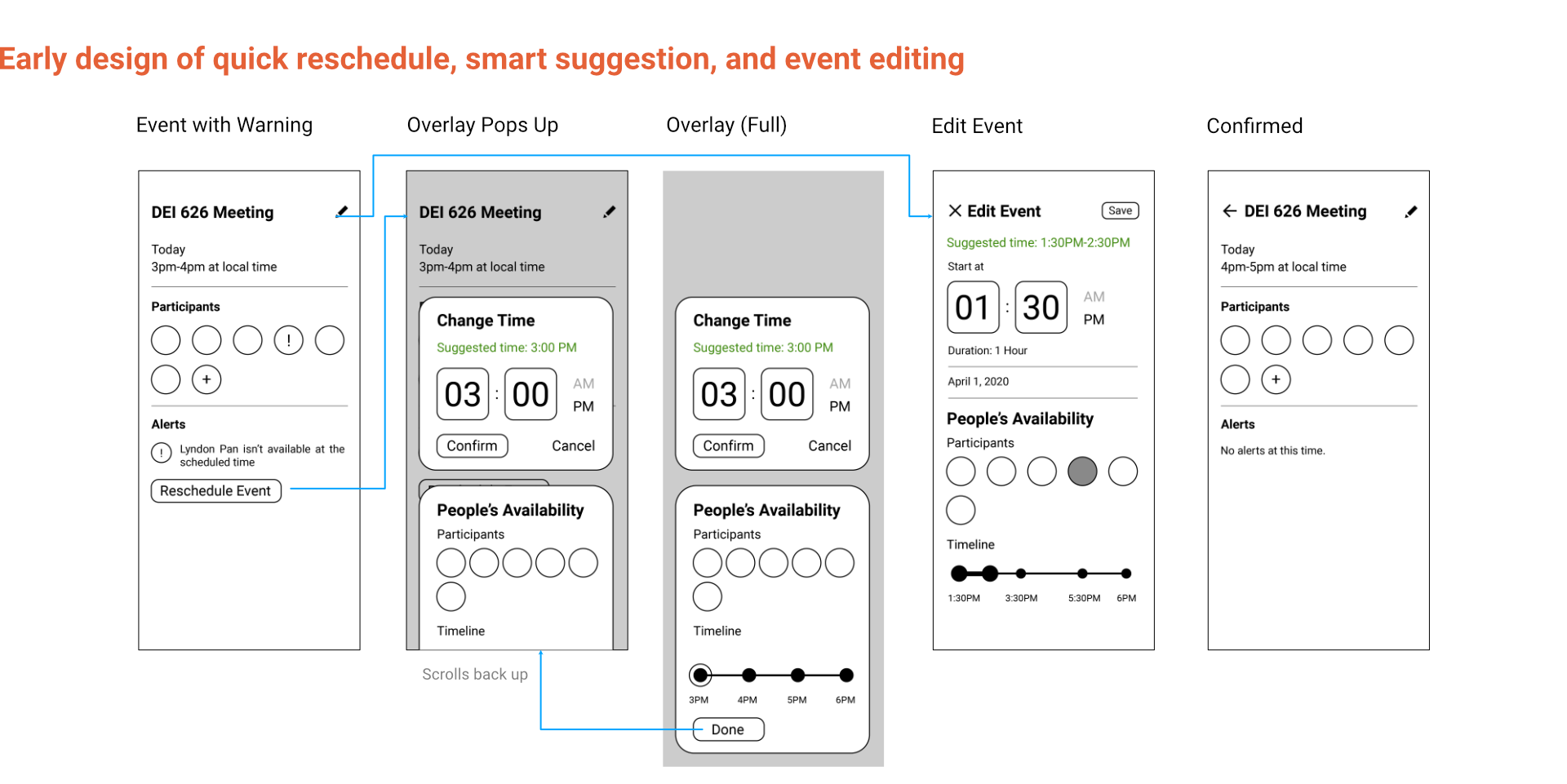
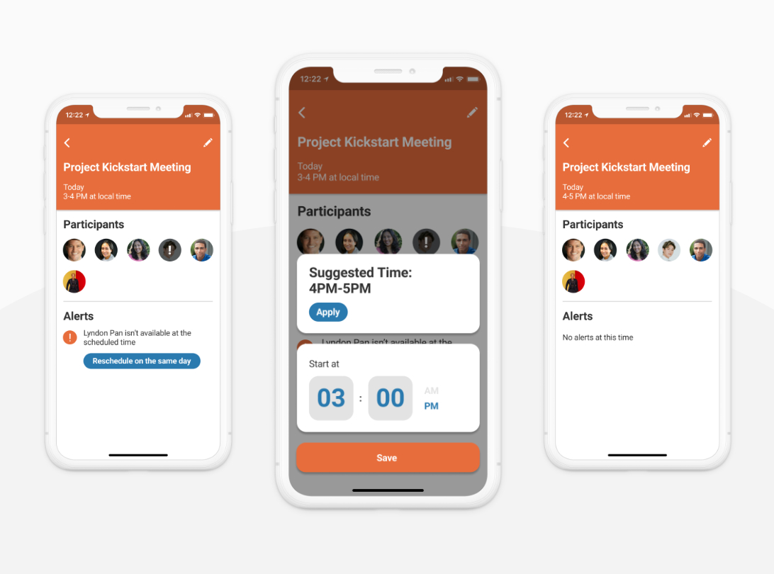
These wireframes were then digitized and used for creating early prototypes for our task based usability tests. This one shown below is for a “quick reschedule” feature, where a user can quickly change event schedules based on participants’ availability. This scenario was later introduced as the background setting during our usability tests.
tuning and finishing touches
From the test feedback, we were able to find some design flaws and make changes accordingly. Participants complained that the timeline used for visualizing the length of the event felt redundant and did not improve readability, so that UI element ended up being removed.
Our team put some extra thoughts into the styling of OnTime, like addressing accesibility – we made sure all screens pass WCAG 2.0 level AA standard for adequate contrast ratio for anyone to read.
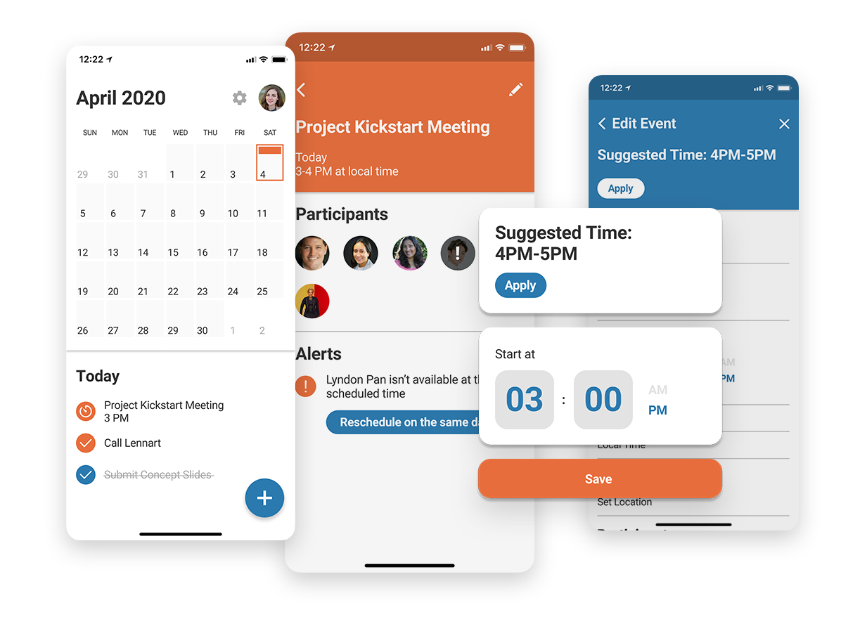
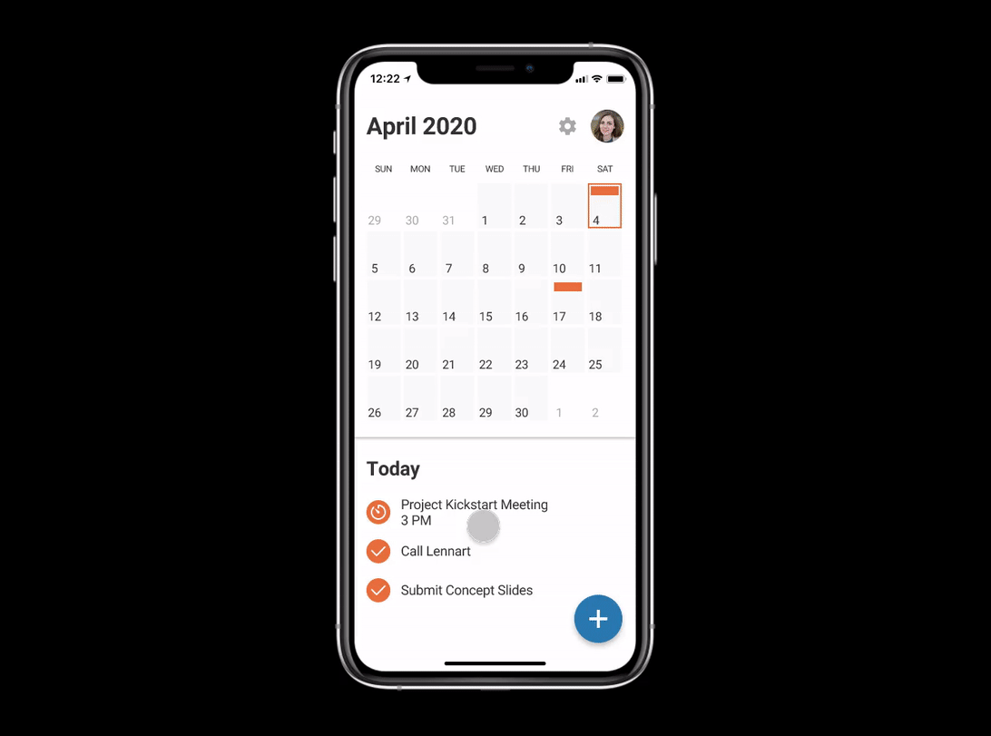
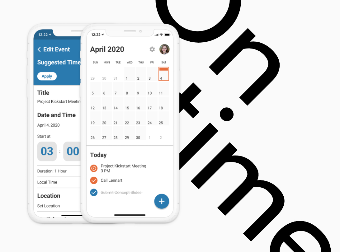
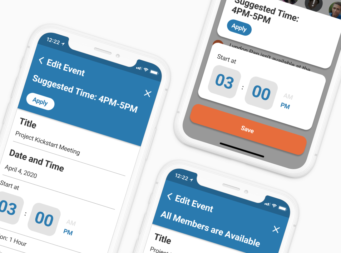
Once the underlying logic of the app was streamlined, our team moved on to build a hi-fi prototype in Figma – I was tasked to do that. We intended to showcase the four primary features we identified from our user research, so we made sure the prototype reaches a look-like, work-like level of fidelity for those specific parts.
OUTCOME
Meet OnTime: A mobile calendar app with business and cross-timezone use cases in mind. It does something unique – suggesting event times based on all participants availability. No more guessing if this person abroad would be available at 3PM EST, no more “does 4PM IDT works for everyone?”, just automically arranged events and every participant will be, in theory, on time.
Interactive prototype available here.
Thanks for Frame’s amazing iPhone mockup frame https://www.figma.com/community/file/893200449910135004/iPhone-Mockup
