A hobby project
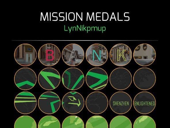
Bannergress (bannergress.com) is a fan-made utility website for Niantic’s augmented-reality mobile game Ingress. Aside from a constant virtual turf war happening in-game, Ingress also allows players to create missions with custom medals to decorate their profiles with, and creative players have been using this feature to display banners (or image mosaics) in their in-game profiles.
IngressMosaik was a website that collects banners around the world through user-generated content. Used to be the go-to place to browse mission banners, it abruptly shut down in 2021. With the goal of creating a better version of IngressMosaik, a small group of players started the Bannergress project and I joined the team as the UI&UX designer.
The process
Learning from the past
Ingress Mosaik was already gone when the Bannergress project started, but thanks to the magical Internet Archive we were still able to have a sneak peak of what it used to be. To the team, Bannergress is not just a replacement of the old site, otherwise I guess I would not be needed in the project. So we started by looking at things that could have been improved.
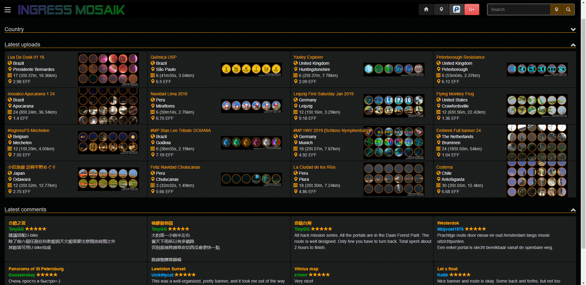
Immediately we were able to identify things that can be different: overall layout, site navigation, mobile friendliness, etc. I will highlight some of these changes below.
Getting to the drawing board
Layout and navigation
This is definitely the biggest piece of the puzzle – the overall structure of the site. We settled on something that can scale smoothly on all kinds of screen sizes, and made sure UI components are grouped in a sensible way. Information density is tuned down a bit from IM to reduce the “information overload” feeling.
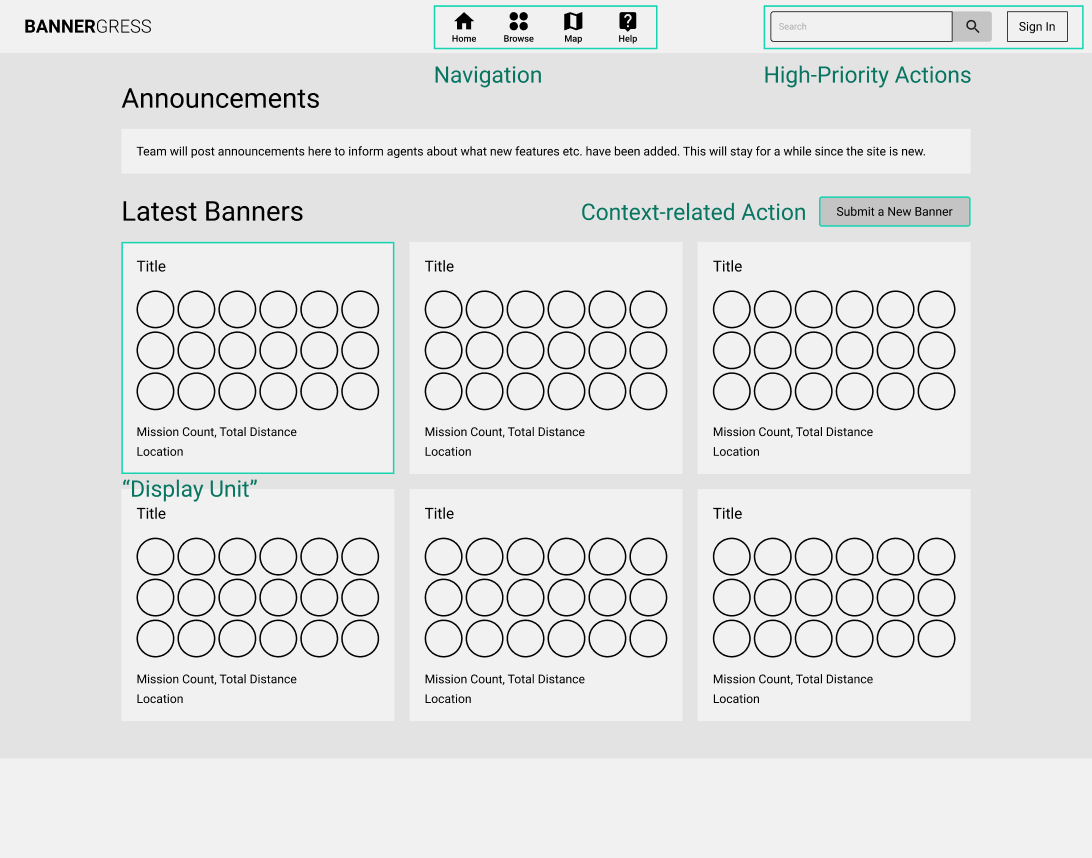
The basic layout we set up allowed us to expand upon it until all features needed for the website were covered. From a high level, the site navigation looks something like this:
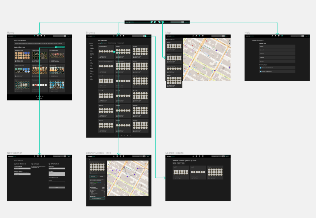
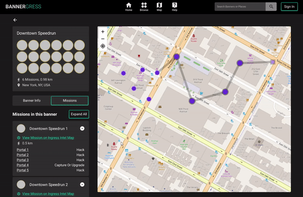
Elements
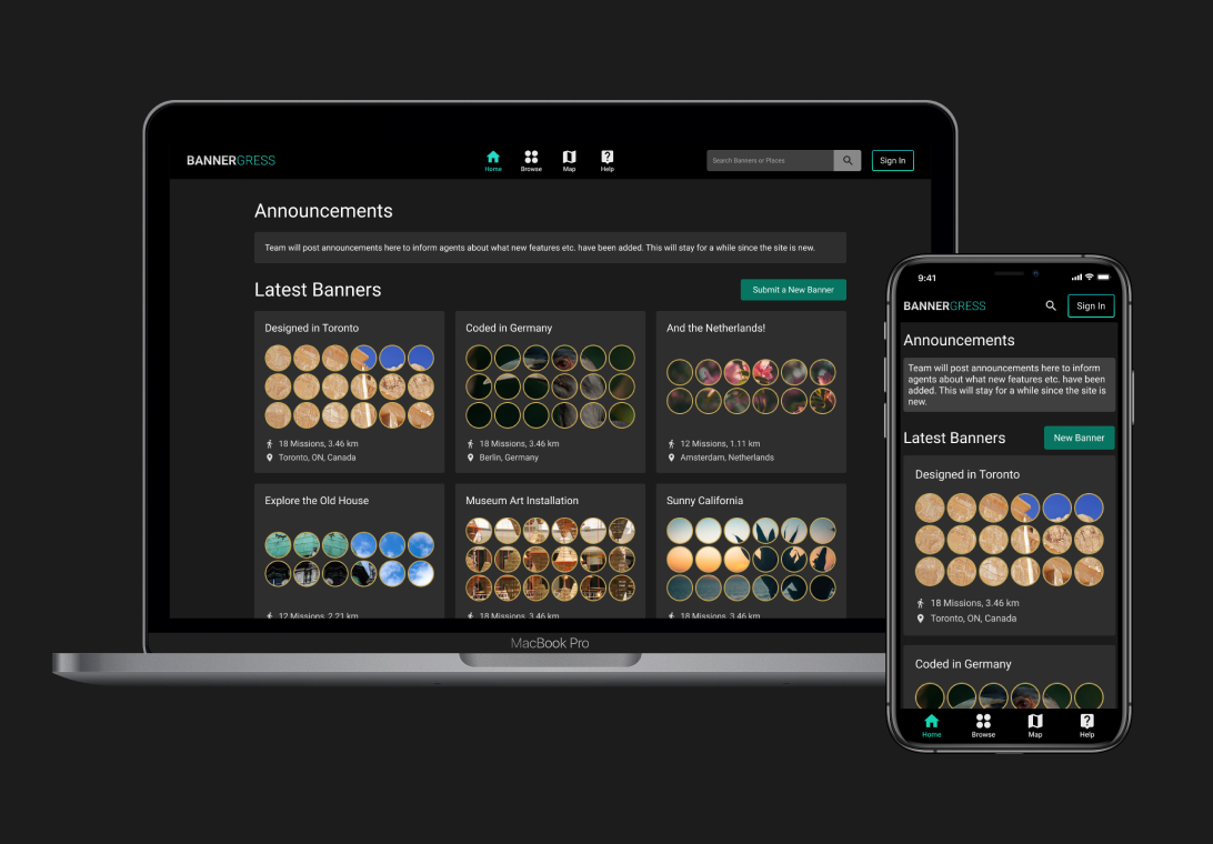
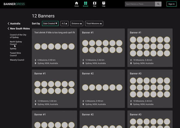
Banner Card, or the “Display Unit”, is a modular piece of UI element that can be seen almost everywhere. This card provides basic information of a banner and serves as an anchor point to more information or actions related to it. The banner image is the most eye-catching thing in this card, and we made sure that the text surrounding it don’t create distraction.

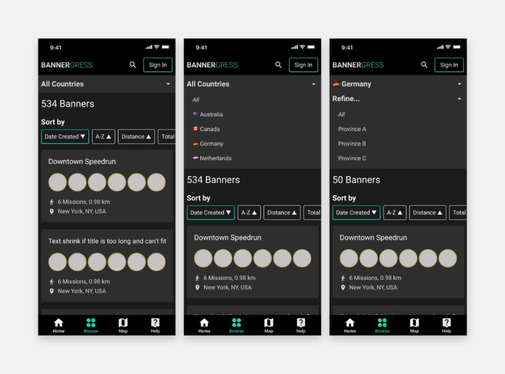
The location drilldown menu was a user favorite in IM, and we iterated on that to create our own take of it in Bannergress. We used different layouts and different interaction logics on the desktop and mobile site, in order to optimize the experience for differnet pointing devices (mouse vs finger).

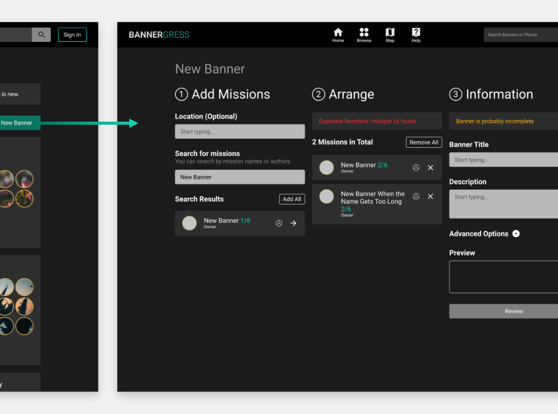
The banner submission workflow was crucial to rebuilding the banner inventory, so we paid extra attention to reduce friction during this process. A 3-column interface was used here to display all needed information on one single screen and all actions are clearly visualized. With help from the developers, smart sequencing and contextual warning messages are also added in, further simplying user inputs and preventing errors.
Interactions
Intuitive interactions are what make a digital product “feels right” – many interactive prototypes were made throughout the design process for the team to review and evaluate together. This really helped the team make decisions on many details regard how the site reponds to user inputs; although not all effects shown here are implemented in V1, quality-of-life changes are constantly being added in after the site launches.

Single-interaction prototypes
Smaller bits of interactive prototypes were used to study the detailed UX of certain UI elements, like this location selection menu specifically designed for mobile platforms that aims to minimize screen height usage. This was great for providing context for quick usability tests or heuristic evaluations.

The outcome
Bannergress launched on May 23, 2021 and continues to be improved based on community feedback. It has already gone through one big update that adds several new features to the initial version, and I’m still working with the rest of the team to make it better.
